Using DCI-P3 Color Gamut For Video Editing
If you have laid your eyes upon the woods of Lothlórien, the desert dunes of Arrakis, or the façade of the Grand Budapest Hotel, you’d have seen how color sets the tone of every film. Color is often used to evoke emotions and set the mood and sometimes, they help to tell the story.
Continue reading to learn more about DCI-P3 and why it is ideal for video editing. You can also explore ViewSonic ColorPro monitors with DCI-P3 color space.
In the case of the movie Moonlight, the character Chiron is often seen with hues of neon pink. The presence of the color depicts Chiron breaking away from reality as he faces his real desires. With color playing such a huge part in film and video, it is crucial for videographers to work on tools – from video cameras to monitors – that have the widest color space possible. And that’s where DCI-P3 comes in.
However, we cannot talk about DCI-P3 without touching on the subject of CIE 1931 – which involves a tedious explanation of mathematical calculations and theories. Without going into too many details, you just need to know that CIE 1931 is an international color matching system that quantifies a measured color, and then reproduces it accurately. The CIE 1931 color spaces describe all visible colors that can be perceived by the human eye.
Most color spaces such as DCI-P3, sRGB, and Adobe RGB are lined against the CIE 1931 spectrum. If you refer to the illustration above, you can see how the different color spaces provide distinctively different color coverages. But what exactly do all of them have to do with video editing and film?
What is DCI-P3?
DCI-P3, formally known as Digital Cinema Initiatives – Protocol 3, is a color space commonly used in digital cinema and is the color standard for the film industry. It covers 45.5% color space of CIE 1931 – this means it has 26% more color space than sRGB and only 4% less than NTSC. It is mostly used in color grading projects meant for theater broadcast.
DCI-P3 vs sRGB
Also known as Standard Red Green Blue, sRGB is the most commonly used color space you can see on most consumer applications from printers to web browsers.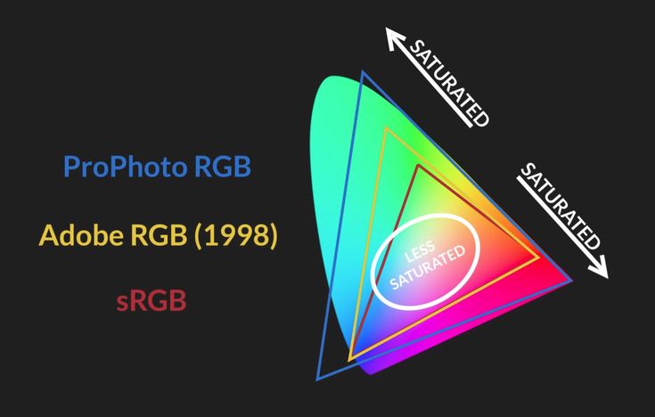 It was defined by HP and Microsoft for displaying images online. Despite its wide implementation across most digital monitors, it doesn’t have a large enough color coverage for professional environments.
As mentioned in the article above, DCI-P3 has 26% more color space than sRGB. This means DCI-P3 offers a greater range of colors at a more saturated and vibrant level. It can use up to 10-bit color as compared to sRGB’s 8-bit, allowing users to enjoy HDR content in even more colors. Unless your videos are only meant for viewing on websites, DCI-P3 should be your go-to for video editing.
DCI-P3 vs Adobe RGB
Developed by Adobe Systems, Adobe RGB and DCI-P3 have a lot more colors in common and are larger than sRGB. They are both usually found on professional monitors and are considered a wide color gamut, which is a new TV technology that offers an increase in color. Think redder reds, greener greens, and bluer blues. However, Adobe RGB leans toward more blues and greens, whereas DCI-P3 goes into yellows and reds.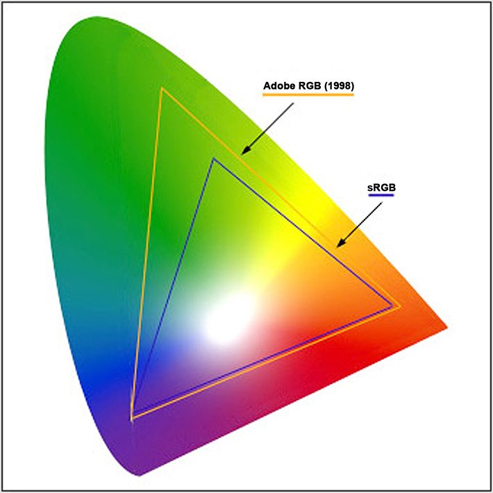
The former is technically good enough for video editing, but if you are working on a film of a movie theater standard, then DCI-P3 would be more suitable. Instead, Adobe RGB is mainly aimed at photo editing and print workflows. As it does not carry the same multimedia capabilities as DCI-P3, Adobe RGB is less widely used on gaming or movie-focused monitors.
DCI-P3 vs Rec. 709
Although DCI-P3 is mostly used by professional colorists for video editing, it is designed for broadcast in cinemas. As many displays still do not support this color space, it is common for Rec. 709 to be used for distribution on TVs and monitors. Rec. 709 is a color standard developed by the International Telecommunication Union Radiocommunication Sector (ITU-R) meant for high-definition television.
As compared to Rec. 709 which has a similar gamut to sRGB, DCI-P3 can display a much wider range of colors and more shades of green, red, and yellow. It is also defined in 8-bit color depth, making it ideal for online streams or TV broadcasts. ITU-R has recently released the Rec. 2020 standards meant for ultra-high-definition television with a wide color gamut – but we will not go into this for now. In all, just remember that DCI-P3 should be a color gamut to use for cinema-grade production.
Why a DCI-P3 Monitor is Ideal for Video Editing?
DCI-P3 is currently not a consumer standard for many monitors since it’s usually used for digital theatrical projection. But with the rise of streaming services and the popularity of highly produced series such as Game of Thrones, The Crown, and The Mandalorian, devices from laptops to mobile phones are adopting DCI-P3 into their displays for a better visual experience. In essence, the line between movies and TV has blurred and DCI-P3 ensures color consistency no matter the channel. To review footage in its most accurate light and color, most professional monitors dedicated to video and film editing are already calibrated with DCI-P3. Whether you are an aspiring colorist or a seasoned video editor, you would want to invest in a monitor with at least 95% DCI-P3 color space for more color coverage and an accuracy tolerance of Delta E<2 for more precise color reproduction and fidelity.
Final Thoughts
Colors are an important supporting act in film. A wide color gamut such as DCI-P3 gives you a larger spectrum of colors to play with during the video editing and color grading process. It also allows you to enjoy Ultra HD, HDR, and 10-bit capabilities to the fullest. If video production and film editing is your main gig, it is important to look for a monitor that supports at least 95% DCI-P3 color space. Even movie lovers can invest in DCI-P3 screens to get closer to a lifelike cinematic experience.
So, the next time you’re looking at Walter White’s highlighter yellow hazmat suit on TV or acid green hues splashed across the Matrix movies in the cinema, remember how DCI-P3 helps deliver more colors in pinpoint accuracy. And ultimately, a beautiful masterpiece to savor visually.
But have you ever wondered what’s the difference between color grading and color correction? They are both key tasks in the realm of video editing, and you can read our guide to know more.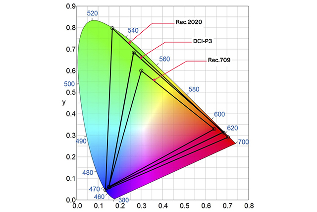 Or discover ViewSonic ColorPro’s DCI-P3 monitors for your next award-winning movie.
TAGS
color managementcolor spacemonitor for creatives
Is DCI-P3 better than sRGB for gaming?
There’s no simple answer to the question posed in the headline. A lot of that has to do with just how subjective vision is and the ways perception of color varies between individuals. But we’re here to discuss color spaces in gaming and gaming monitors. Well, that subjectivity can’t be eluded using something as simple as a QTE as there’s quite a lot of background to it so strap in.
DCI-P3 and sRGB represent color spaces or color gamut. They attempt to scientifically represent natural color as seen by the human eye for the purposes of reproducing color. That includes the monitor or TV on which you enjoy your gaming. Color space definitions arrive from many organizations and associations worldwide, but arguably the most important has to be CIE 1931.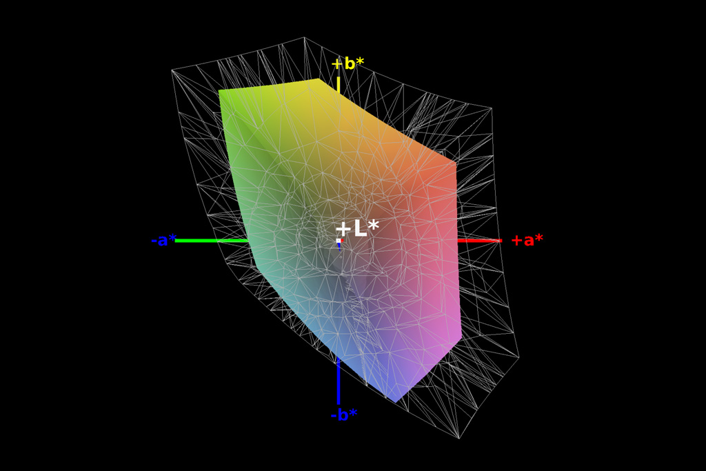 The International Commission for Lighting in 1931 formulated the modern definition of standard RGB, otherwise known as sRGB. That standard remains by far the dominant color format for Windows, Xbox, PlayStation, Switch, and every other gaming platform you can think of. Game developers create graphic assets in sRGB with almost none even considering other color space definitions.
But the truth is that RGB obviously dates back to early in the previous century. The format reached its max potential with 8-bit, 16.7 million color displays, and that’s what we have in games. It’s also why all those pulsating lights on everything from case fans to gaming mice go by “RGB lighting”, since they’re limited to a 16.7 color definition.
The Society of Motion Picture and Television Engineers, or SMPTE, and a group of major movie studios created a much wider color gamut called DCI-P3 in the late 2000s. It stands for Digital Cinema Initiatives – Protocol 3 and pairs beautifully with 10-bit, 1.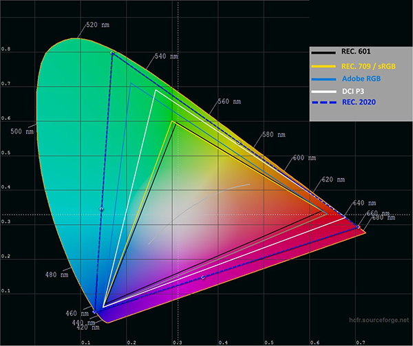 07 billion color displays. While sRBG emerged in the days of standard definition, DCI-P3 and its relative Rec. 2020 were created for ultra HD and HDR. We have a lot more about bit depth and color spaces if you’re interested.
sRGB and DCI-P3 don’t come close to capturing the “true” spectrum of human color perception. By most estimations and with CIE 1931 as an index, sRGB covers just over a third while DCI-P3 comes close to about half of human color sensitivity. But the technological effort to get there continues.
If you want a bottom line right now, it’s that sRGB works fine for gaming because games are created with sRGB by default. Unlike movies, TV shows, pro photography, and design, where DCI-P3 and other wide gamut formats have become the norm. However, while sRGB definitely suffices for gaming, DCI-P3 may be up your alley because it saturates colors and some people enjoy that effect.
DCI-P3: the space of the future
Without sounding rude, sRGB is very 20th century. DCI-P3 appears on a growing number of monitors and TVs as it’s just the way things are headed. Why not show more colors and richer images if you can? Sticking to sRGB kind of comes across as lazy if you stop to think about it. But industries do have to consider wide compatibility, and because regular RGB has become so prevalent, creating games in that color space pretty much guarantees consistent results on any screen. Sadly, those results may be consistent, but they don’t look as good as they could.
You see (pun notice), DCI-P3 has a color gamut at least 25% wider than sRGB. That could make a big difference. Imagine an in-game bonfire. With sRGB that bonfire looks OK but with DCI-P3 it’s considerably closer to what a real life bonfire would look like. The same applies to any color. Pick one and with DCI-P3 it’ll appear more vivid and intense than in plain old RGB. We just got used to RGB (or standard RGB) to the point of resting on our laurels. Comfort breeds complacence and all that.
With DCI-P3, graphic artists get more room to showcase creativity. The movie, TV, and professional imagery industries figured this out years ago, but game developers seem to lag behind. So while display makers continue to add support for wide color gamut standards like DCI-P3, at the moment it’s true developers aren’t in a hurry to make use of that support.
But DCI-P3 is the future of color on your screen, there’s no doubt about that.
Looking ahead in color and ready for what’s to come
As 4K UHD and ever-improved HDR firmly move from the previous realm of the exotic to the mainstream, DCI-P3 and similarly endowed color spaces become a necessity. RGB will soon finally feel limiting enough to prod developers in the right direction. As we write this in early 2020, we look forward to new graphics cards with drivers that reliably support more than just RGB and of course new game consoles that operate with 4K and HDR as their baseline. That advancement will compel developers to adopt wider color spaces.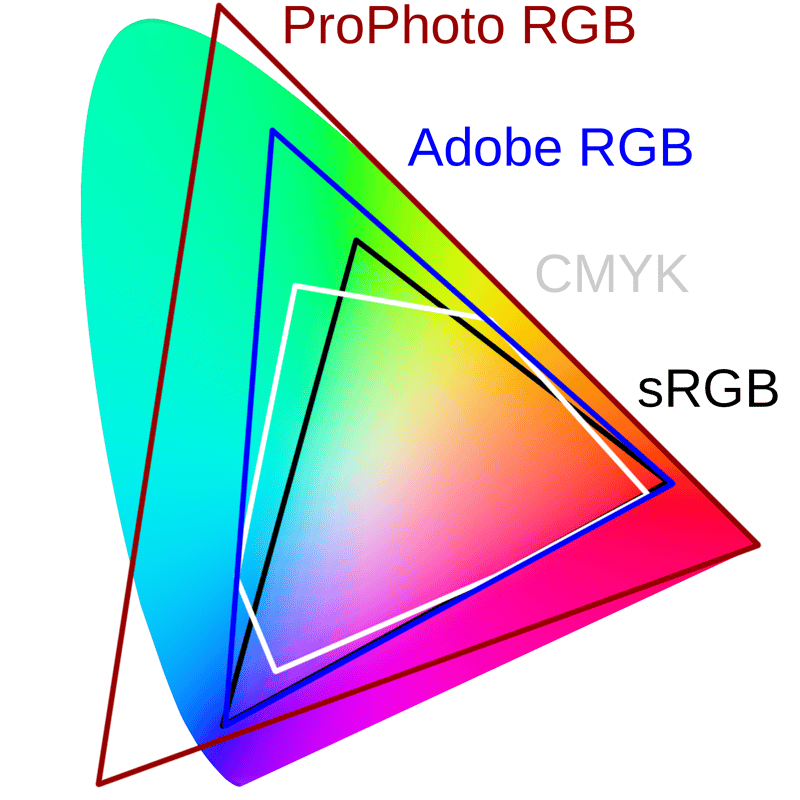
That means getting a monitor with an 8-bit panel and just sRGB support right now makes little sense and offers no futureproofing. Going for 10-bit or higher panels with DCI-P3 provides the peace of mind of knowing you’re ready for when wide color gamut support becomes a must-have. Also, you can start experimenting with color spaces right now if you have a DCI-P3 monitor. Hook up your PC or console and select DCI-P3. Your monitor will then upconvert sRGB input into DCI-P3, resulting in saturated colors. You may like what you see. Some people find the effect exaggerated, others think it’s great.
With an sRGB-only display you don’t have the option of testing this out for yourself. And with price differences continuing to decrease, you should definitely go with a monitor that offers DCI-P3. It’ll also have sRGB obviously for current gaming, since DCI-P3 includes sRGB. The reverse isn’t true, leading to a very clear conclusion: go with DCI-P3 even if right now at this very moment it doesn’t do anything for your gaming. It will soon enough.
{{title}}
We will notify you when the product becomes available.
Name
Email
*
Required.
Invalid email format.
Required.
We will send you an email once the product becomes available.
Sorry, our store is currently down for maintenance.We should be back shortly. Thank you for your patience!
What is a color space? Parsing
The perception of color is a rather subjective thing. Someone likes more saturated and contrasting colors, someone, on the contrary, prefers more restrained shades. However, even in such a subjective matter as the perception of color, there is a rigorous science. Surely, you have heard such terms as sRGB, delta E. Today we will figure out what it all means …